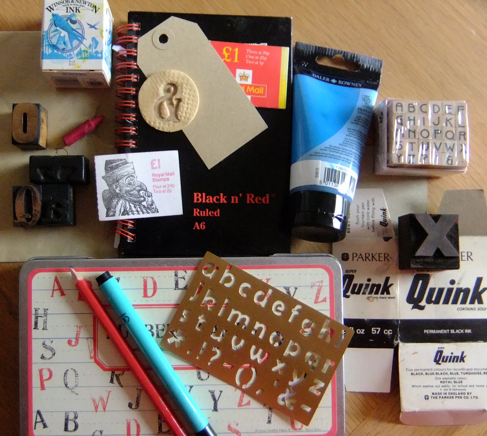
CHAPTER ONE
1. I've chosen to work (play?) with the word "alphabet"


3. Above: an illustration of an 8th century Spanish alphabet.

4. Above: alphabet by Paul Shaw, 1986, in a style reminiscent of the early 20th century.

5. Above: alphabet by Jean Larcher, late 20th century French, but based on German manuscripts of the 14th and 15th centuries.

6. Above: alphabet by US artist Sheila Waters.

7. Above: just because I like it, a screenprinted cushion made by Ineke Berlyn.
and finally ....
Ekphrasis is a
literary device in which a text responds to or describes another work of art,
very often a painting or sculpture.
"The painter's products
stand before us as though they were alive,
but if you question them, they maintain a most majestic silence.
It is the same with written words; they seem to talk
to you as if they were intelligent, but if you ask them anything
about what they say, from a desire to be instructed,
they go on telling you just the same thing forever" - Socrates.
but if you question them, they maintain a most majestic silence.
It is the same with written words; they seem to talk
to you as if they were intelligent, but if you ask them anything
about what they say, from a desire to be instructed,
they go on telling you just the same thing forever" - Socrates.
- 0 - 0 - 0 - 0 - 0 - 0 - 0 - 0 -
CHAPTER TWO

1. Above: handwritten "alphabet" using nib dipped in sepia ink and reloading when the ink ran out.


2. Above: A4 sheet pleated and the word written over the "pleats" and then the paper opened out and more writing added to the blank areas.

3. An old rattan panel was placed under paper and ..

... this shows the resulting distortion when I wrote out "alphabet".

4. A placemat was placed under paper and ...

I wrote out "alphabet" allowing the mat to distort the letters and making the letters wider as I moved down the sheet.

5. Above: I wrote the word in black pen, brushed red ink over it then infilled any "enclosures" with a repetition of the letter.

6. Above: an attempt to square off the lettering, then I shaded in the enclosed areas.

7. Above: straight lines or "tangents" to form the letters. I use a piece of card dipped in ink for this sample.

8. Above: the word impressed using black biro on black paper, then shaded over with soft pastels to show up the lettering.

9. Above: I selected "p" and "b" and traced them from a plastic sheet onto paper forming a motif which I feel could be useful later on in this module.

10. Above: I printed off the dictionary definition of "alphabet" to form a repeat pattern. I used this as a background to print the word using red acrylic and a pen cap.
DESIGN USING THE COMPUTER ...
alphabet alphabet
alphabet alphabet
alphabet alphabet
alphabet alphabet
alphabet alphabet
11. Above: I had some fun with various fonts.
speech; basic
principles or rudiments, as of a subject. A set of letters or other signs used
in a writing system, usually arranged in a fixed order, each letter or sign
being used to represent one or sometimes more than one phoneme in the language
being transcribed; any set of symbols or characters, esp one representing
sounds of speech; basic principles or rudiments, as of a subject. A set of letters or other signs used in a
writing system, usually arranged in a fixed order, each letter or sign being
used to represent one or sometimes more than one phoneme in the language being
transcribed; any set of symbols or characters, esp one representing sounds of
speech; basic principles or rudiments, as of a subject a set of letters or
other signs used in a writing system, usually arranged in a fixed order, each
letter or sign being used to represent one or sometimes more than one phoneme
in the language being transcribed; any set of symbols or characters, esp one
representing sounds of speech; basic principles or rudiments, as of a subject. A set of letters or other signs used
12. Above: the dictionary definition of "alphabet", used in (10) above as a background.
Wow, you have had such fun with this chapter Anne. I wouldn't have believed that it was possible to be so imaginative with the alphabet!
ReplyDeleteWhat a great start ! Ideally enjoyed playing with the lettering in this module,looks like you will too.
ReplyDeleteOh I did not know about this other blog of yours you naughty one! Brilliant what you are doing with letters, what a heady start
ReplyDeleteThank you! I really am having fun! I've decided that going it alone is not working so I am going to post little and often so I benefit from frequent feedback.
ReplyDeleteHow inspiring Anne, this looks like so much fun, I love working with text! Theres a good website I use at work called www.dafont.com, might be useful?
ReplyDelete